Poster Re-Design
Bad Ads
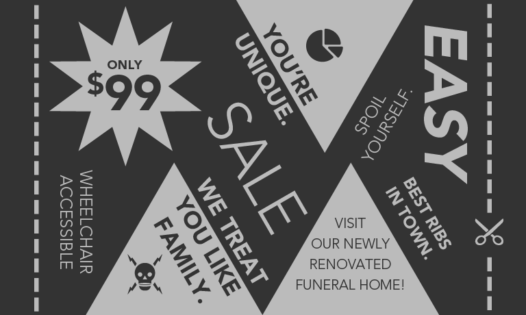
- Eureka! I’ve found it! The holy grail of horrible ads!
- Viewers should not have to work to know what this is about.
- I have no idea what this is about. Funeral home? But then there’s “best ribs in town” and “You’re unique”.
- Content is confusing: (in the text) but also the images. The skull is not appropriate for a funeral home, and I’m not sure what the pie shape is doing there either.
- Placement of text – self explanatory
- Contrast – not significant enough
- I’m sorry… Easy? And no, please don’t spoil yourself. I can’t wait to get my hands on this one.
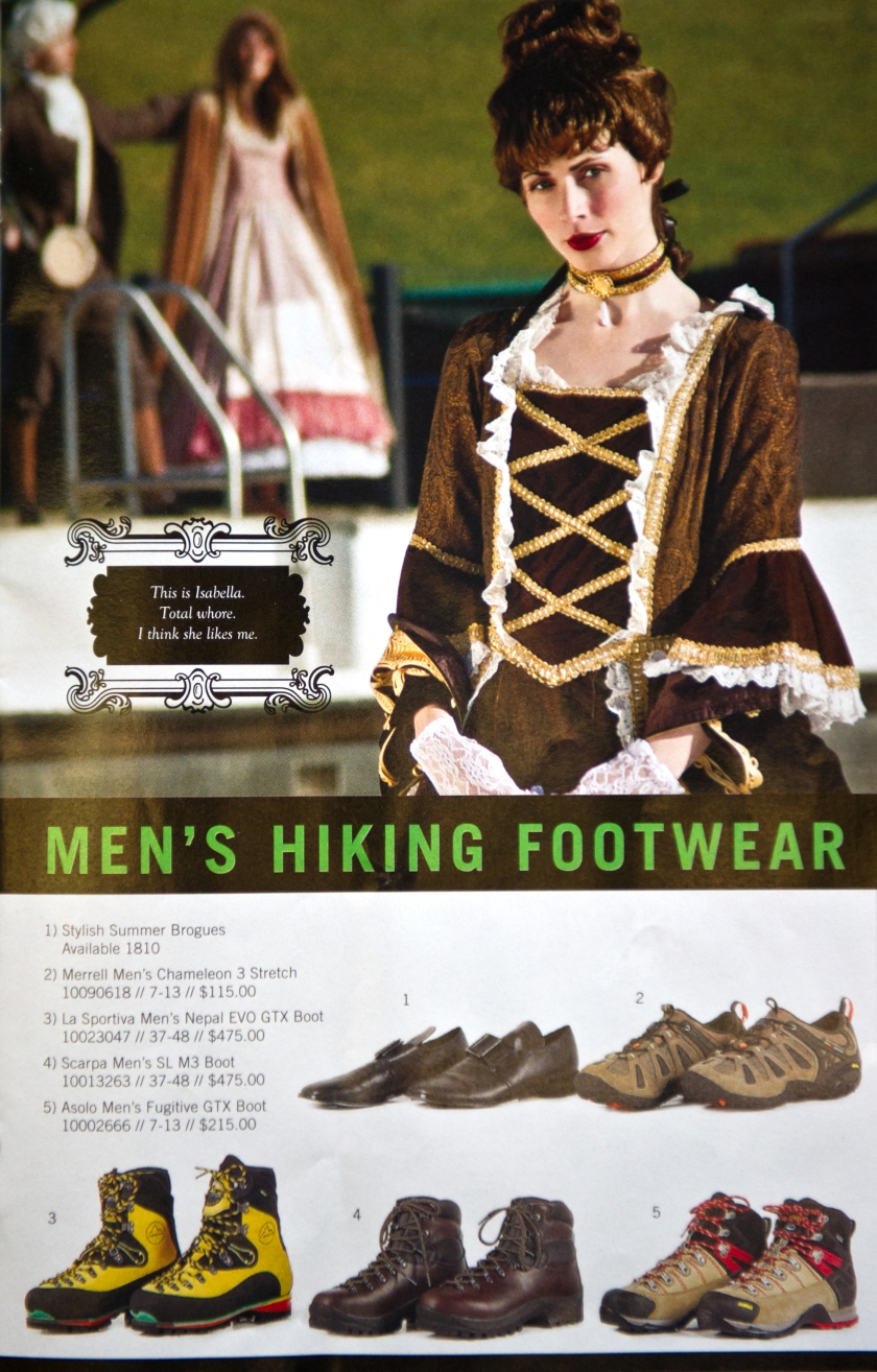
- What does this whore have anything to do with hiking boots.
- The text next to the boots looks more like catalogue information or what would be in a fashion spread, rather than an ad for the company.
- It took me several look-through’s to find the “1) Stylish Summer Brogues, Available 1810” next to the old style man shoes. First of all, these aren’t hiking boots in the slightest. The 1810 thing has absolutely nothing to do with hiking boots, which is the biggest text on the ad.
- Who is talking? “I think she likes me” who’s me? The language is contemporary too: “total whore”.
- Where can we purchase these boots? They’re all different brands, but we don’t see what store the overall ad is for.
- Also, the design is just kind of lame. It looks like two separate things. The font does match the hiking aesthetic, but the green used doesn’t match the grass in the photo. The box containing the “men’s hiking boots” text divides the ad further.
- According to The Big Four article, the viewer connects ideas by grouping, placement and uniform suit. This one would be tricky to redesign.
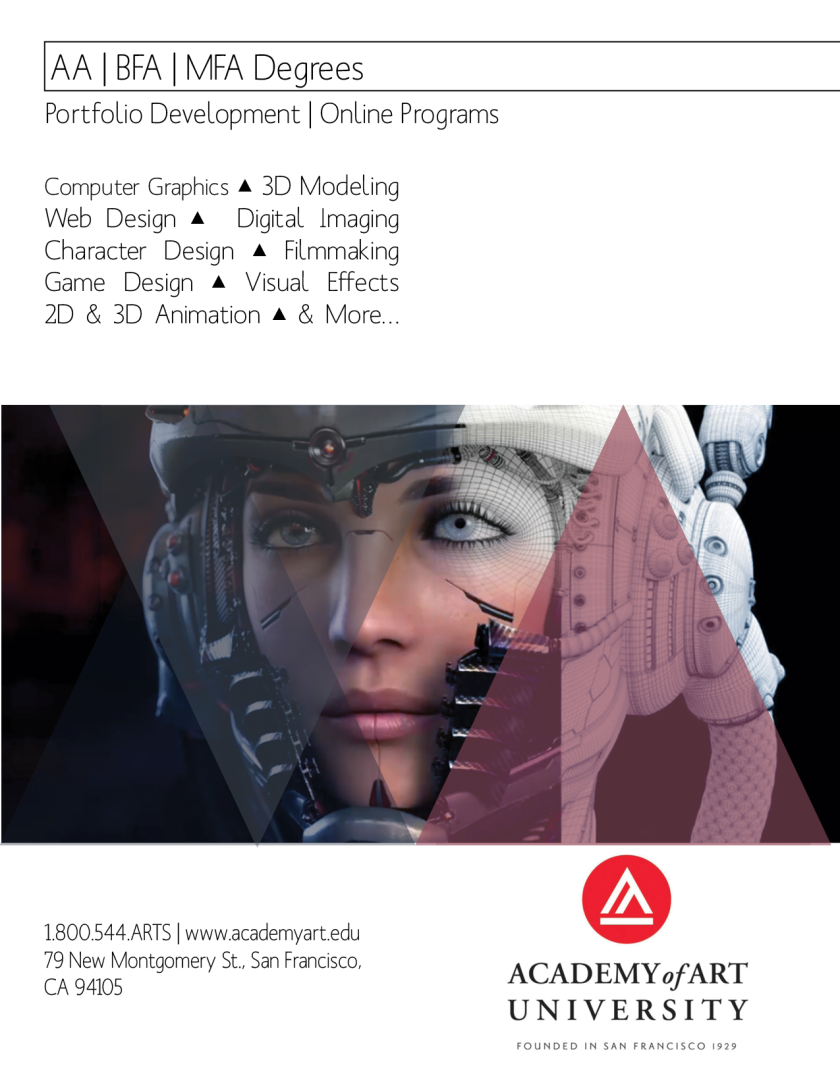
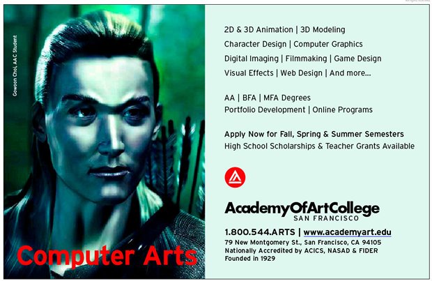
- Other than Academy of Art College, none of the text on the side is emphasized. The eye has to travel to the left, rather than to the right, which is unnatural, to eventually see “computer arts” in a non-uniform text. The use of red in “Computer Arts” suggests a connection to the red logo to the right, but that logo stands for “Academy of Art College” which has an entirely different font.
- The text above the logo on the right needs reworking and prioritizing.
- Contrast – not enough contrast between the image on the left and the background color on the right
- Also, why choose this shiny Legolas picture for the poster? What does it suggest? A: Fantasy, gaming, character design. Those points should be closer or on the image to show that it’s an example. Or, no words at all on the image, and computer arts at the academy should be the most prominent text idea.
- This is nitpicky, but why is the letter spacing so close together in the Academy of Art College?
Pseudo Selfie
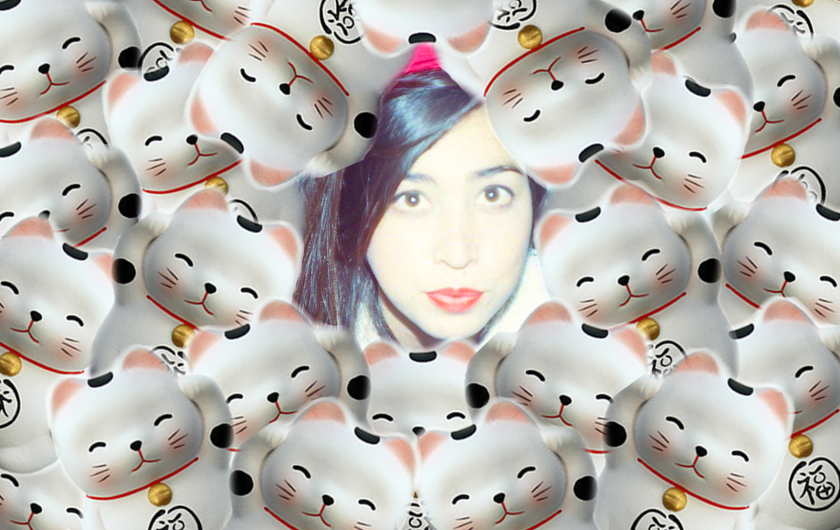
People call me NatCat. I have almond eyes and full lips. People say I have an Asian nose. Well Asia’s a big place.
“The maneki-neko (Japanese: 招き猫?, literally “beckoning cat“) is a common Japanesefigurine (lucky charm, talisman) which is often believed to bring good luck to the owner. In modern times, they are usually made of ceramic or plastic. The figurine depicts a cat(traditionally a calico Japanese Bobtail) beckoning with an upright paw, and is usually displayed—often at the entrance—of shops, restaurants, pachinko parlors, and other businesses…
Even though maneki-neko is a Japanese term and maneki-neko are Japanese figurines, they are sometimes incorrectly called the “Chinese lucky cat” and are increasingly popular among Chinese merchants.”
– Ancient “Asian” Proverb Wi-ki
Selfie – In the way I view myself, I never really identify with my Chinese heritage. Neither does my Grandmother. She’s from Hong Kong, and moved to Honolulu when she was little. With a strong base of family in Hawaii, she became complacent. She left everything behind, moved to SF and completely started over. My mother is half, and I’m a quarter. It’s surprising to me when people ask me if I can speak “Chinese” when they find out I have Chinese relatives (who also don’t speak any Cantonese or Mandarin). I thought I’d take my nickname and be selective about the particular “cat” image. (Refer to wikipedia info above). Cat is synonymous with Nat in this instance.
